Components

Button
The Button component is a push button that allows users to trigger an action. It is customizable with labels, icons and images.

Checkbox
An interactive checkbox that provides various functionality such as handling change events, setting the position and visibility of the checkbox, and managing its read-only and tab-traversal states.

Choice Box
The Choice Box is a responsive component that provides methods for adding, inserting, and selecting items, as well as registering callbacks for selection, opening, and closing events.

Combo Box
Similar to a Choice Box component, but allows users to inert text within an entry field.

Drawer
webforJ's Drawer component allow developers to create a container which slides into the viewport to expose additional options and information.

Dialog
webforJ's dialog component is built to allow a developer to quickly and easily display a dialog on their application, for instances such as a login menu or information box.

App Layout
A powerful, easy to use and fully customizable layout which provides a header, footer , drawer, and content section all built into a responsive component which can be easily customized to quickly build common application layouts such as a dashboard.

Flex Layout
An efficient and intuitive way to layout applications and components - the Flex Layout allows for items to be displayed either vertically or horizontally following the CSS Flexbox rule set.

List Box
The List Box provides functionality for creating and manipulating a list in an application, and includes adding and removing items, selecting and deselecting items, handling events, and setting various properties.

Progress Bar
The Progress Bar component is fully customizable with various themes, expanses, and options such as orientation and indetermination to provide information to the users of applications.

Radio Button
A RadioButton component is a graphical user interface element that allows users to select a single option from a predefined set of mutually exclusive choices by clicking on a small circular button, indicating their selection with a filled dot inside the button.

Slider
The Slider component provides methods to set and retrieve properties such as orientation, minimum and maximum values, tick spacing, and callbacks for scroll events.
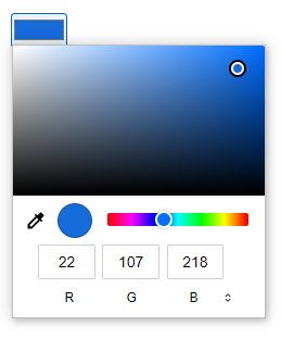
ColorField
The ColorField provides a user interface component that lets a user specify a color, either by using a visual color picker interface or by entering the color into a text field.
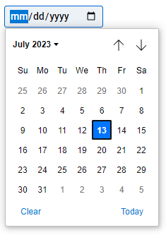
DateField
The DateField provides a user interface component that let the user enter a date, either with a field that validates the input or a special date picker interface.
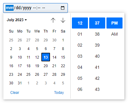
DateTimeField
The DateTimeField provides a user interface component that allows the user to enter both a date and a time, including the year, month, and day as well as the time in hours and minutes, either with a field that validates the input or a special date-time picker interface.

NumberField
The NumberField provides a user interface component let the user enter a number. They include built-in validation to reject non-numerical entries.

PasswordField
The PasswordField provides a way for the user to securely enter a password and has a toggle for password visibility.

TextField
The TextField provides a user interface component to create a basic single-line text fields.

TimeField
The TimeField provides a user interface component that designed to let the user easily enter a time (hours and minutes, and optionally seconds).